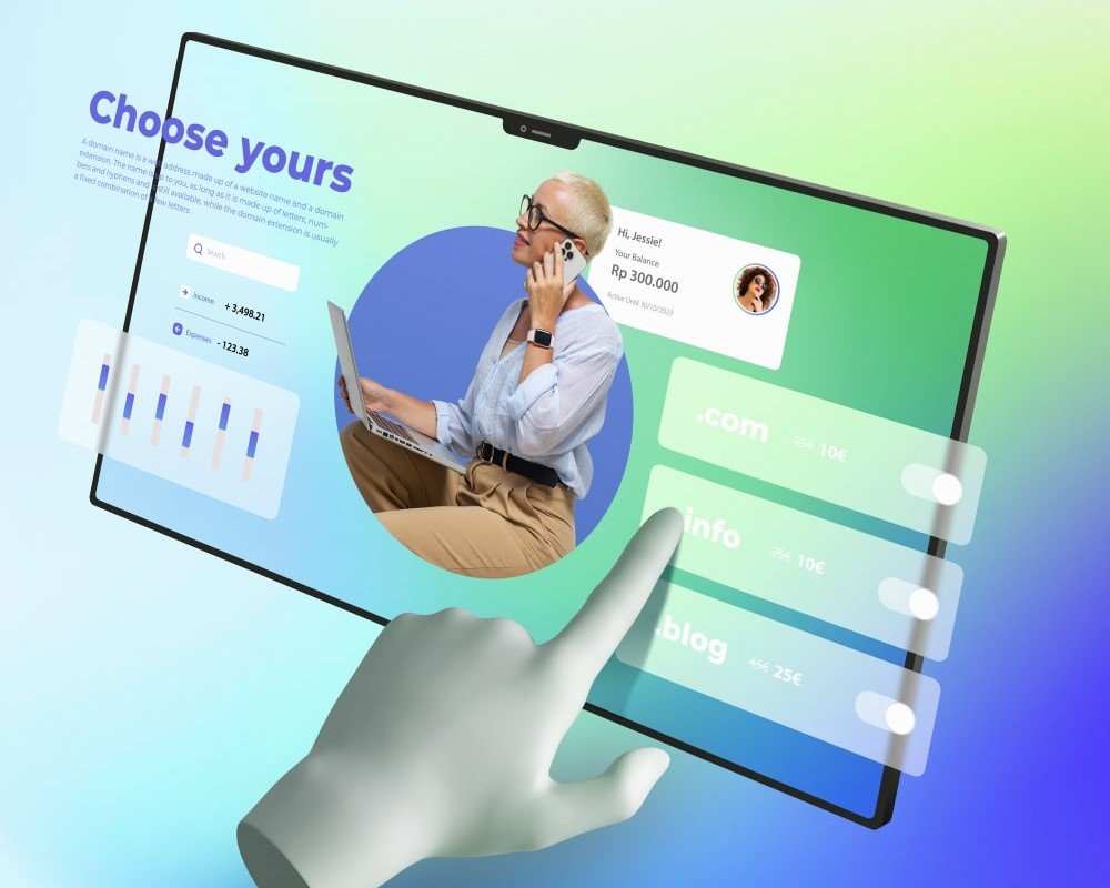
One Experience That Works Everywhere
We design responsive websites that adapt beautifully to phones, tablets and desktops, giving every visitor a clear and comfortable experience.
- Mobile-first layouts and flexible content
- Fast, accessible and touch-friendly interfaces
- Consistent brand presentation on every screen
Designed for real-world browsing
From a first mobile visit to a detailed desktop comparison, each layout is planned to keep content readable and actions easy to find.
How we work
1. Understand: We start by learning about your business, audience, goals and the practical problem the service needs to solve.
2. Shape: We turn those insights into a clear plan, visual direction and technical approach that your team can review with confidence.
3. Refine: We test the important details, respond to feedback and prepare the final work for a smooth launch and future growth.